
Using Contrast to Pop your Ecoprints!
- M Theresa Brown

- May 27, 2023
- 5 min read
It doesn't take magic formulas, secret ingredients or a chemistry degree to learn simple techniques to make your ecoprints "pop" no matter what surface you are working on!
Let's learn how thinking about "Contrasts" when placing your leaves or adding a background can change the whole look of your piece!

Let's look at Ecoprinting as an art form! When you think past "putting leaves on fabric and getting a leaf imprint" and see ecoprinting/botanical printing as a work of art, then the art concepts all artists learn begin to make sense! Understanding what those concepts are can be a huge help in all areas of ecoprinting and the best thing of all? When you know what to look for, it all falls into place!

I'll try eliminate too much "Art Speak" here. Let's look at this brief Wikipedia definition of what makes up an art piece "Elements of art are stylistic features that are included within an art piece to help the artist communicate. The seven most common elements include line, shape, texture, form, space, color and value"
Value is what I want to concentrate on in Ecoprinting. Values are essentially a range of shades from dark to light. (see chart) In art school we had to constantly practice using a pencil to "shade" or graph (1 being the darkest and 10 the lightest)

See the dog portrait? In order to not lose a White dog on a white or light background, I added a darker value so the dog itself would "pop." In the portrait of the boy, I darkened areas around his hair and face so the highlights in his hair, shoulders, etc. would "pop" a bit more.

Contrast is essentially another word for value! By using a dark background on the light dog, the contrast brings the focal attention to the dog.
In the boy's portrait, the contrast helps with the overall look by bringing out the sun's highlights on his hair and face.
All photographers learn the same principals of contrast and value as seen with the photo below.
The morning sun shining on those maple tree pods would make them disappear into the pale morning sky if their glow had not been highlighted by contrasting them with the dark tree line behind them.

In ecoprinting, we rely on mordants and warm heat to help influence the tannin and even chlorophyll in the leaves and plants so they can print on the surface of any light colored fabric such as silk or wool. This is where understanding contrast can be especially useful!
In the beginning, you really don't know which plants print the best or which ones don't print at all! There is nothing more frustrating than to spend time collecting, then placing and then processing your bundles only to open them and find half the leaves did not print! Ah but look closely. Sometimes they DID print but the contrast was too light (white dog on white background syndrome!) More on that after the mordant information.
Rather than give up on the leaves that you feel were a flop, rethink it. Plants fail to ecoprint for several reasons. Let's hit the basics:
Plants are governed by their environment-they are a living, breathing entity and even fall leaves on the ground have been influenced by the heat, cold, damp, drought or whatever stage they were in, in their growth cycle, when picked for use. Pick sooner or later for next time use!
Your process-check water temperature (whether simmering or steaming) I simmer mainly and keep everything under 185F.
Your mordants. Is it too strong? Too weak? Not the right mordant?
You bundles too loosely! Or your bundle was too dry or too wet.
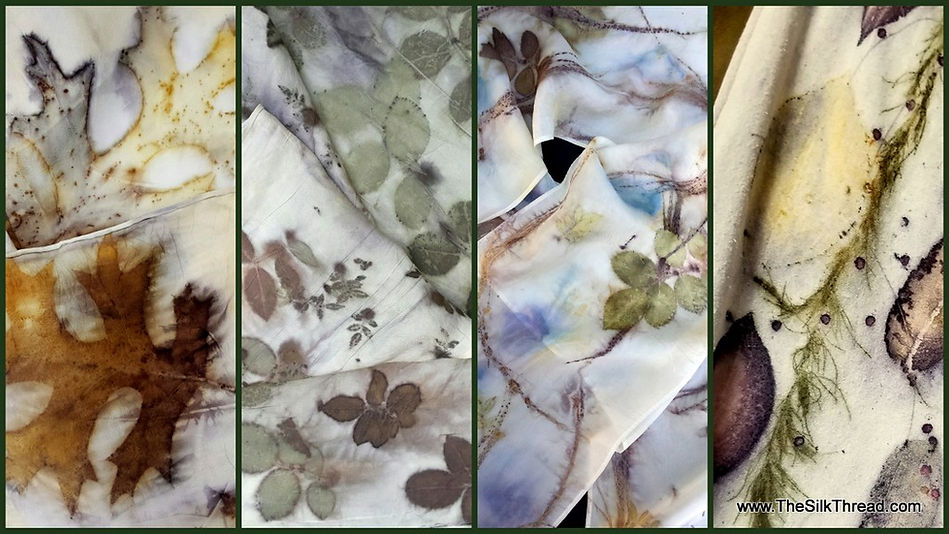
Mordants: I work with 4 mordants-Iron which darkens (saddens) your leaves, Titanium Oxalate which brings out oranges in most plant tannins, Alum which brings out yellows and Copper which brings out greens in some plant matter.
See how the use of iron and Titanium Oxalate influenced the tannin in the leaves on these silk scarves!

Now what does CONTRAST have to do with placing your leaves? In the natural use of your leaves, dipped in a mordant or two, without the addition of a dye blanket to add background color, it means everything! In a recent leather class that I taught in Kentucky, my student used store bought daisies. Look closely and see how the daisies without a dark printing leaf behind them, fade almost completely into the background! This is a perfect example of contrast saving the over all image from fading away and the artist feeling like the daisies were a failure!

Now look at another example of a set of leaves that printed beautifully on the leather and yet the daises (see yellow centers?) appeared not to have printed. But they ARE there and would have popped with a darker printing leaf as contrast behind them.

Below is a good example of leaf contrast on paper. There really are some leaves that no amount of mordant influence can alter their "light" look, but with a bit of experience and knowledge, it's easy to spotlight them with a contrast!

Below are more daisies gathered from my pasture. See the difference between those that had the pecan leaves behind them and those that did not? Now these were white petaled daisies. Look for similar flowers but with colored petals such as blanket flowers and gerber daisies and get ready for some fun in contrast!
Experiment with new leaves by placing leaves that you know are reliable printers under them "just in case". We've all had those big blank spots where we optimistically tried the giant fern or leaf, expecting it to print and the results were less than stellar!


And finally let's talk about that biggest of contrasts-color! Without a doubt, color can make even reluctant leaves "pop." Personally, regardless of my years of experience and knowledge, I have never had success with Gingko leaves from my area! But I solve that by knowing what I am up against and using a color background (but even a dark printing leaf under the gingko would work!)
In this smaller version of the first photo in this article, you see pecan leaves and dog fennel in both images on white silk. The white petaled daisies on the far right have been influenced by the blue dye! That is not always the case, but it is always a nice surprise. Since I know the pecan leaves are strong printers I could have situated the white petaled daisies on top of them for a contrast (just like the leather pocketbook) and you would have noticed them. There is some natural color within all leaves and often your mordants plus your dyes, will alter the final version and give you some lovely surprises!

This beautiful piece by one of my students shows the power of contrasts and the influence of mordants! It's not about formulas, imported plants and rare dyes....it's about the basic principals of art. Let the leave do most of the work. You just help them along with contrast placement. Make an effort to understand the plant environment around you and learn what's in your own neighborhood.
And above all? Embrace the joy in ecoprinting! Keep it fun!
Till next time,
Theresa


Comments